| I’ve had a web presence starting in 1996 and have been designing web sites ever since. I currently use WordPress exclusively. I also employ HTML and CSS only (no Flash-based sites). I’ve thought of offering my rates on this page but have experienced so many varied requests for page design that I absolutely MUST know in advance the exact nature of the site you need designed, it’s complexity, and the full extent of artistic development you will need performed before I can give an accurate price.
My design philosophy: If you are looking to make it to the Top 40+ WordPress Sites List, I can more than easily do that for you. However, I believe that most websites are designed to convey information. If you want to be dazzled / entertained by a website, hit up YouTube but if you want your information to get out there as quickly and easily as possible, having a flashy site may not be your best choice. Now, I can think of a few exceptions to this (like if you’re a graphic artist trying to show an online portfolio of your work) but this is rare –as rare as the need for a headshot on a resume! Although I am more than capable of making flashy, graphically intensive websites, I’d prefer to build sites that “do their job” the best they can.
Below are some examples of my work…
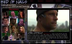
 -click image for larger view- Bed of Nails (TV Pilot)
Originally designed in WordPress, this site eventually went to a completely pure CSS design as the client had very specific creative needs that WordPress simply couldn’t accommodate. This was a significant step for me personally as I had never designed a site from the ground up using CSS. Up until this site, I designed a site in pure HTML (usually using tables for layout positioning). Any use of CSS came in the form of pre-coded templates I would employ. But I soon learned that the “old method” of a completely HTML-designed site is no longer compatible across PC / Mac systems. CSS was the design platform of choice. I had to learn the entire coding language as I went. Thanks to sites like W3Schools, I was able to get there in about a good day’s reading and testing –a truly invaluable resource for any webmaster! I also employed several tricks to ensure that no Flash animation was used on the site. This was necessary as search engines cannot pickup text from a Flash design. Lastly, I would also like to thank Firebug for their wonderful Firefox plugin for helping me analyze my code on the fly. All graphical elements on the site are my own work. Starting with high-def content from the client, I created all of the color corrections, backgrounds, textures, and montage elements strictly using Gimp.
Check out the live site at BedofNails.tv!! |
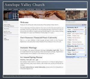
 -click image for larger view- Antelope Valley Church
This site was designed to allow the Antelope Valley Church to better market their building for facility rental. In addition, this site used an integrated Google calendar and multiple page templates to use 1, 2, and 3 column layouts. |
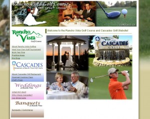
 -click image for larger view- Rancho Vista Golf Course / Cascades Grill
Another heavily customized WordPress theme. This website was built to advertise a golf course, restaurant, and banquet hall located in Quartz Hill, CA. Using both my own original photography and images provided by some of the wedding photographers. I created the collage imagery for the front page as well as the header. In addition, I created panoramic shots for the bridal suite, restaurant view, and outdoor gazebo site. |
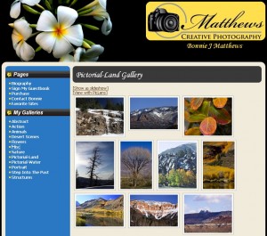
 -click image for larger view- Matthews Creative Photography
This is a simple photography website for a local photographer. Using her artistic input as a guideline, I created this site and added a user-updatable gallery based on different categories (a WordPress plugin). |
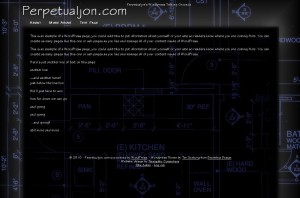
 -click image for larger view- Construction WordPress Theme
I started with an existing theme and heavily modified the design to create what you see here. The background imagery was a result of a scanned blueprint, turned negative, and then darkened. |
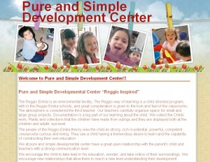
 -click image for larger view- Pure and Simple Development Center
Another heavily modified WordPress theme. I reduced much of the “flair” of the original theme to convey the simplicity of the day care company. I modified the header to show images they provided (to replace the original ones that were provided). By keeping the original artwork in it’s native layers using a photo editor, I can replace these top 4 images in the future without too much trouble. |
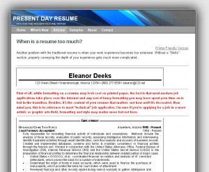
 -click image for larger view- Present Day Resume
This site was created while I was in transition between straight HTML and WordPress. Here, I implemented CSS into my sites to allow global style changes as well as being able to create “printer-friendly” elements (another feature of WordPress). I have since closed the site and will work on the project at a later date when I have more time to dedicate to the complex task of training people for effective resume writing. |
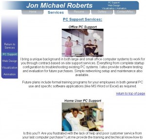
 -click image for larger view- Jon Michael Roberts
This was an iteration of a earlier personal website I created to market some of my work. I show it now simply to highlight the original graphics and artwork, the simplicity of the layout, and the intuitive navigation design. This site was created entirely in HTML and designed specifically for fast-loading (not nearly as important as it used to be) by recycling much of the graphic elements throughout different page loads to boost the browsing speed. |
|
